 In the blog items above we will keep you posted via a daily log of our cruising experiences throughout January & February. The first ship is Royal Caribbean's Serenade of the Sea (see photo)... capacity is about 2,500 people, 962 feet long, 1050 cabins, 25 knot cruising speed and 858 crew. It was built in August, 2003. Donna and I look forward to your reactions or questions and comments as we travel. And say 'Hi' to our traveling companions, Aimee and Craig. Click here for a Caribbean slideshow.

Thursday, December 30, 2004
CARIBBEAN CRUISE NOTES
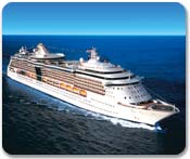
In the blog items above we will keep you posted via a daily log of our cruising experiences throughout January & February. The first ship is Royal Caribbean's Serenade of the Sea (see photo)... capacity is about 2,500 people, 962 feet long, 1050 cabins, 25 knot cruising speed and 858 crew. It was built in August, 2003. Donna and I look forward to your reactions or questions and comments as we travel. And say 'Hi' to our traveling companions, Aimee and Craig. Click here for a Caribbean slideshow.
Subscribe to:
Post Comments (Atom)
2 comments:
Slide show is nice. Colors on blace are hard for me to read because of the contrast escpecially on font under 14.
I noticed you only had 4 adwords instead of the 12 Adwords allow on your site. You might want to put some information about the Tsunami on your site or maybe a link to another site with info. Keep on rolling.
Cuz. Brian
Brian Nelson
31 Gessner Rd.
Houston, TX 77024
713-467-3025
Fax 713-467-3102
bnelson@PartyTentCity.com
www.PartyTentCity.com
www.BrianNelsonConsulting.com
Per Brian's inquiry about our choice of background colors, there are literally millions of black and dark blue background sites on the web today ... because they're cool and easy to read. Now, I have nothing againt white or other colors, but black has always been associated with the photo industry (ie darkroom), and videography and artistic themes. It's part of the so-called branding color pallette of the trade ... which people have come to expect. In a nutshell, the background sets the mood for the site. Also, video and photo images tend to stand out from black better than white ... which, of course, I have allot of.
Then there are the more technical reasons why I use black, articulated by Joe Gillespie, who authors Web Page Design for Designers. Joe says "The difference between printed and screen-based text is in the fact that computer displays are luminous. Printed material is viewed by reflected light and the contrast ratio - the difference in brightness between the darkest and lightest parts of an image - is restricted. On a computer display, the contrast is much greater. Black type on a white screen is actually very difficult to read because of the contrast and ‘glare’. This is why most film and television titles are reversed out. (when was the last time you saw back text on white background for the credits at the end of a movie??)
"Older computer systems used reversed-out type for word processing, white out of blue, green or amber out of black. This was actually easier to read than the current trend towards WYSIWYG black on white. There is a lot to be said for reducing the contrast of text on a Web page. The ‘default’ - black on light grey is actually quite good in readability terms if somewhat boring and academic-looking. Dark text on any muted background colour is preferable to white."
Post a Comment